WE ARE ROSIE
ART DIRECTION | VISUAL IDENTITY | BRAND EVOLUTION
We Are Rosie Rebrand
We Are Rosie is a different kind of marketing company. Built as a collective of independent talent rather than a traditional agency, their brand has always been about people, flexibility, and breaking free from rigid systems.
As their offerings evolved and their partnerships became more elevated and white-glove, the visual brand needed to evolve with them.
At We Are Rosie, their method is their magic, and now it’s part of how the brand looks and behaves.
The brand evolution was a close collaboration between a strategist, a copywriter, and me as the creative and art director, working alongside core leaders on the We Are Rosie team.
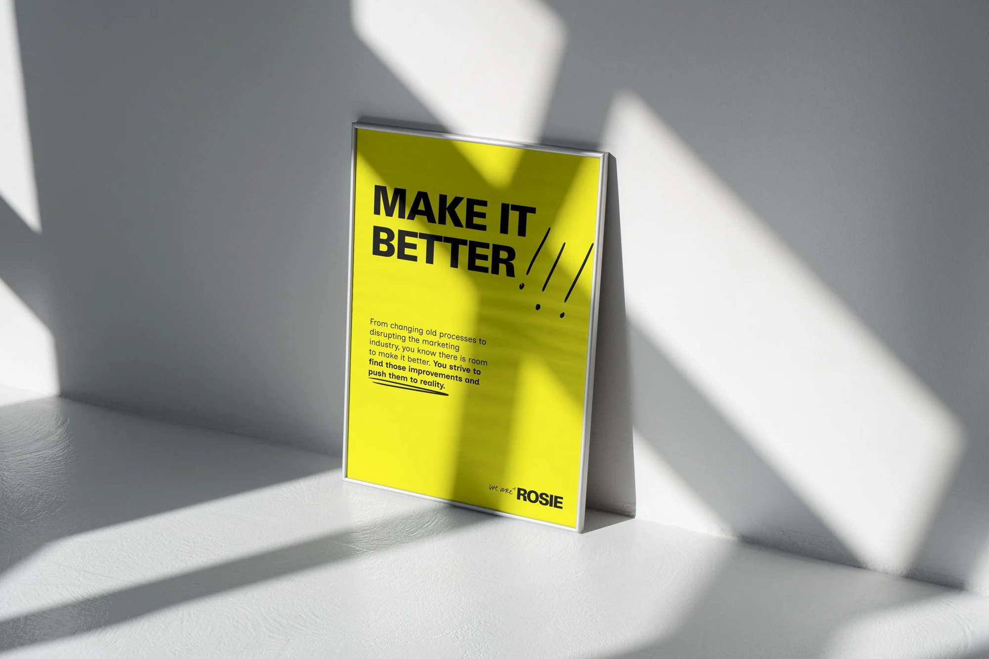
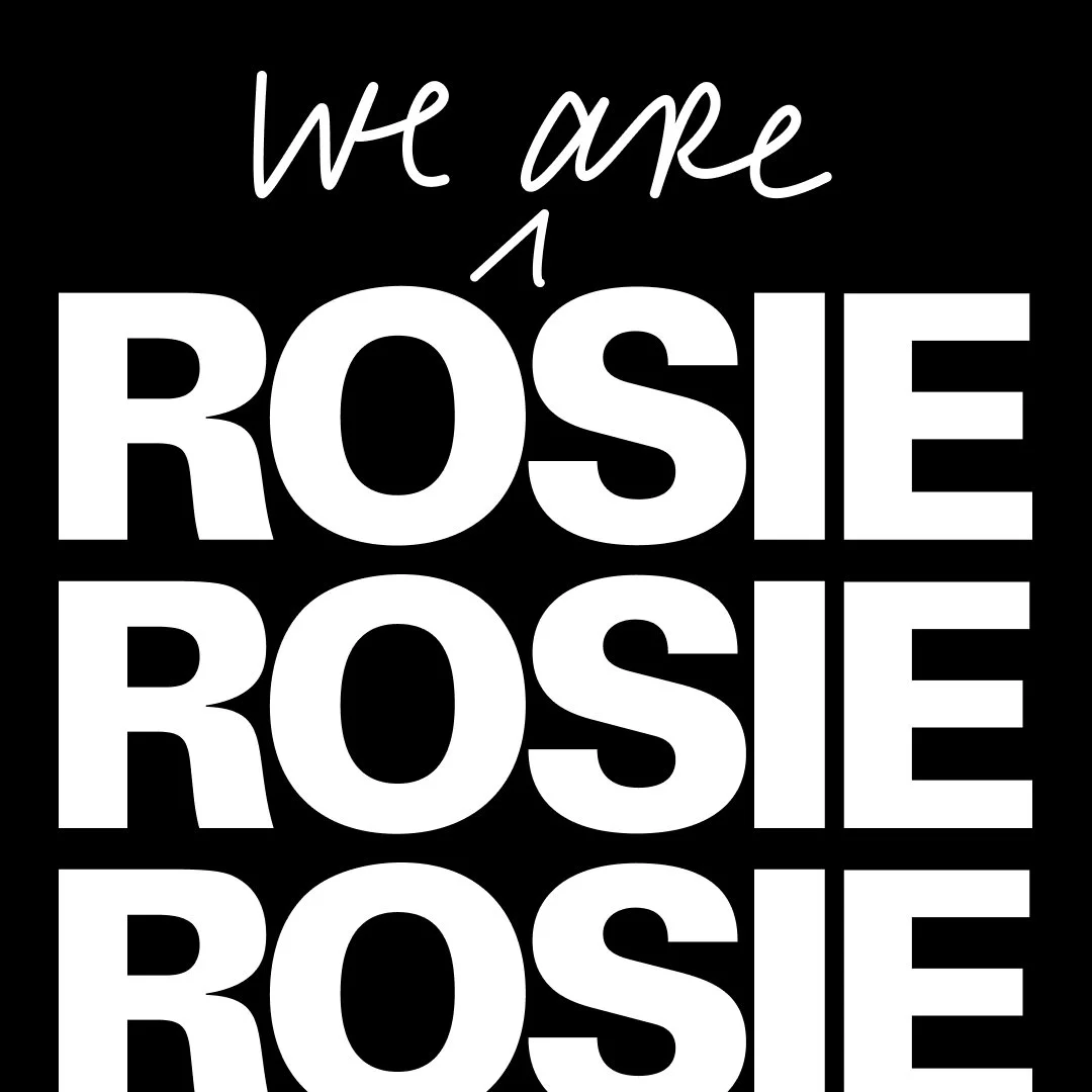
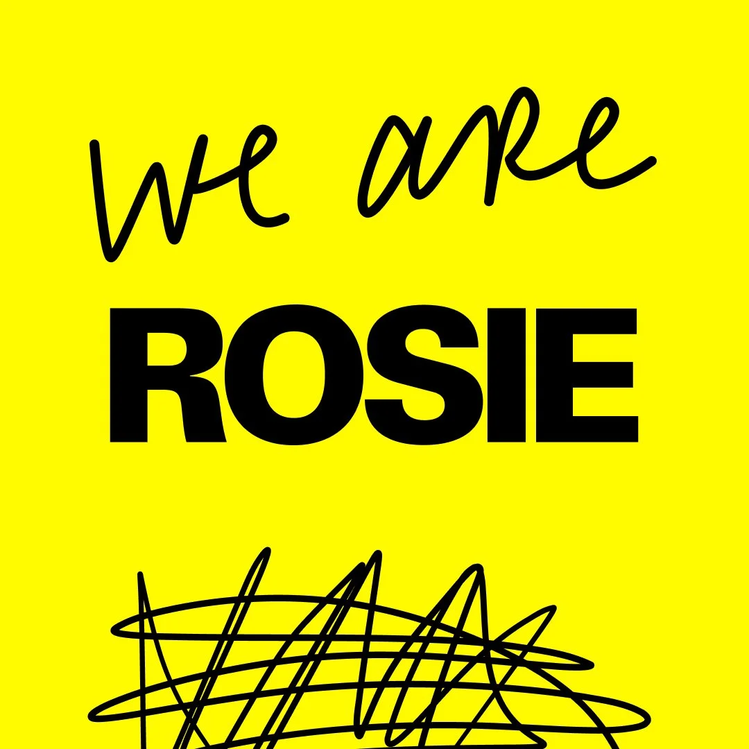
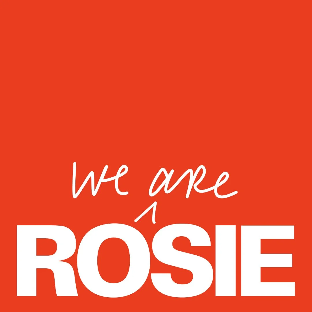
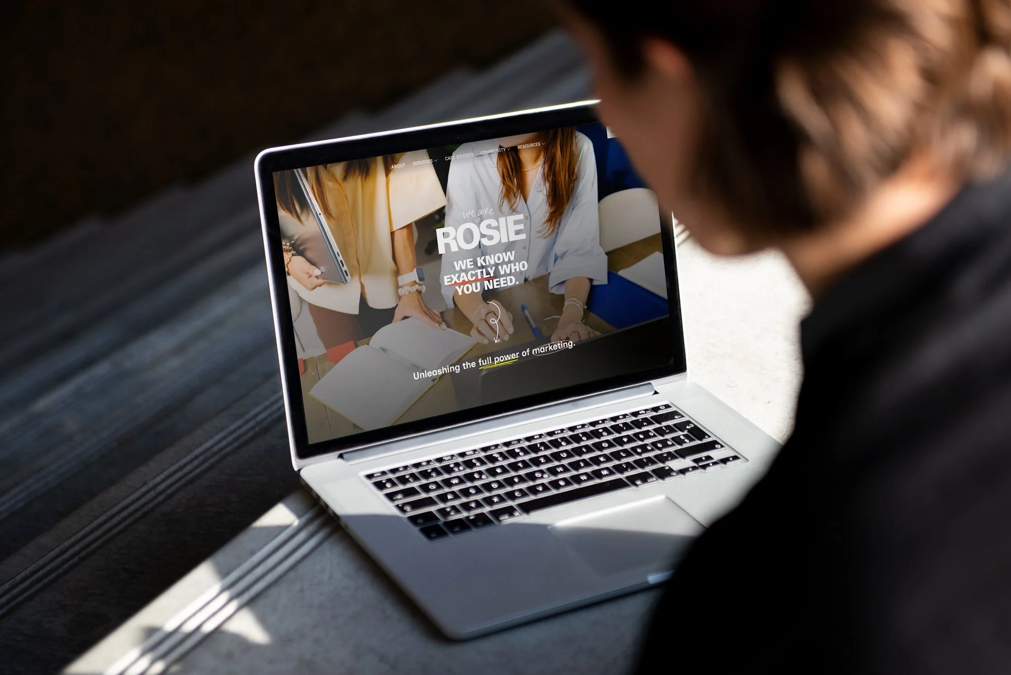
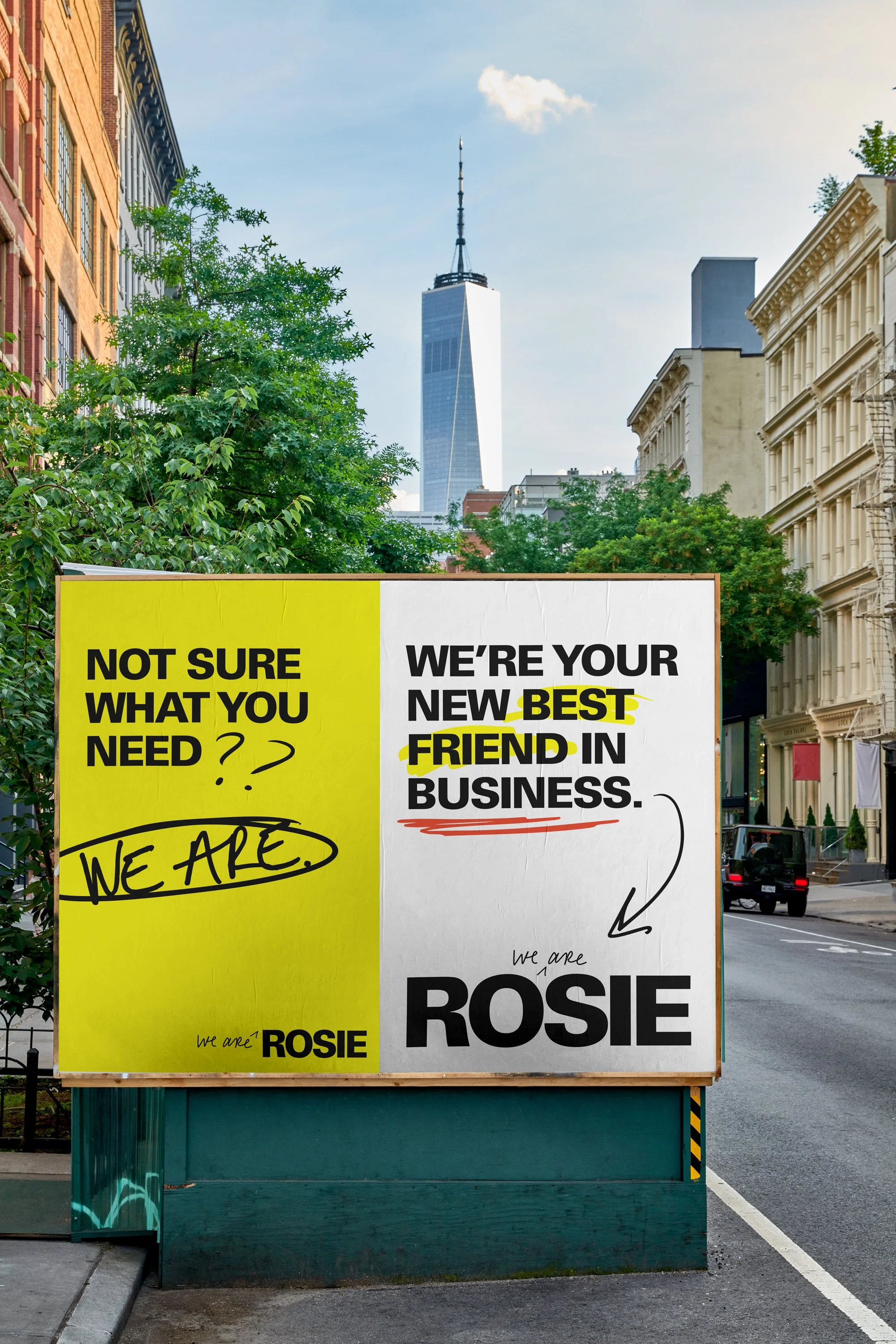
I developed a brand identity and system that feels transparent, editorial, future-proof, and human-first. Something flexible enough to grow with WRR, but intentional enough to feel truly owned. A system that could hold both credibility and a sense of play.

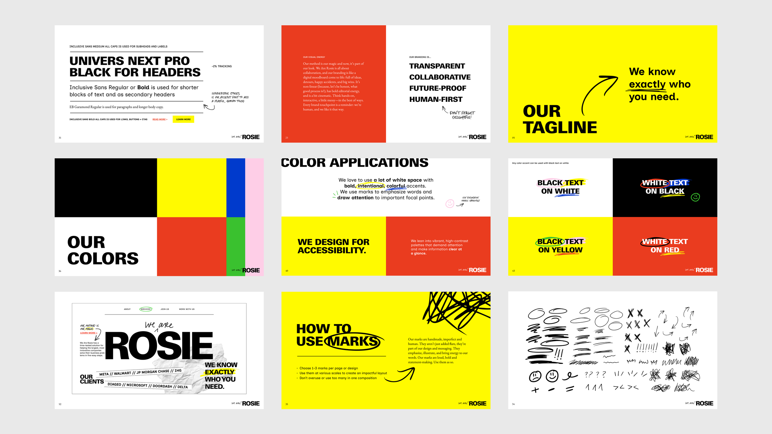
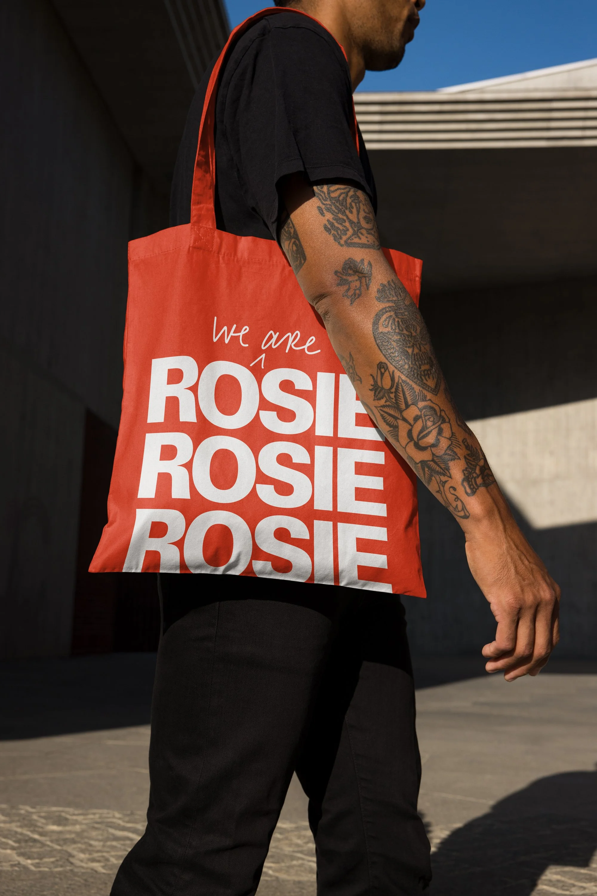
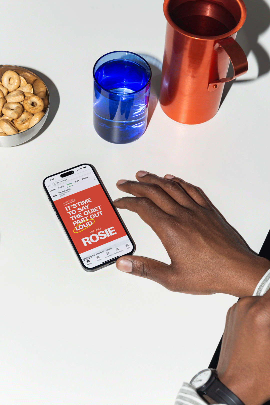
The identity works more like a digital mood board come to life. It’s collaborative and non-linear, full of ideas, detours, happy accidents, and big wins.
Visually, the system has bold editorial energy with a slightly cinematic feel. It’s hands-on, interactive, and a little messy in the best way. Every touchpoint is meant to feel human, because, well, that’s the whole point.

“Kim is one of those creatives with a sixth sense for crafting standout brands. When it came to re-envisioning our eight-year-old brand for the future, she brought bold concepts that challenged us to think outside the box while keeping the process focused and moving quickly. She hit every deadline, integrated feedback seamlessly, and was a joy to work with. We couldn’t be happier with the results.”

—Briana Palma | Head of Marketing, We Are Rosie